The Power of Colour in Branding: What Your Palette Says About You
When building a brand, colour isn’t just decoration, it’s communication.
The palette you choose says something long before your words do. It shapes perception, sparks emotion, and influences whether people trust, buy from, or remember your brand.
At NATABENÉ, we believe colour is one of the most powerful tools in brand identity, and it’s often underestimated. Here’s what every business should know about the role of colour in design, and how to choose a palette that truly reflects who you are.
Why Colour Matters
Colour affects how we feel, behave, and connect. In fact, studies have shown that people form judgments about products and brands within seconds, and up to 90% of that decision is based on colour alone.
Your brand palette creates an immediate impression. It signals what you stand for, who you’re for, and how you want to be perceived.
What Different Colours Represent
While colour meanings can vary slightly across cultures, here are some of the most widely recognised associations in branding:
-
🔴 Red – Passion, energy, urgency, strength
Great for bold, high-impact brands or industries that rely on action… think food, fitness, entertainment. -
🔵 Blue – Trust, stability, calm, professionalism
A favourite in tech, finance, and healthcare… anywhere reliability and security matter. -
🟢 Green – Growth, nature, wellbeing, balance
Commonly used in eco brands, wellness, food, and finance. -
🟡 Yellow – Optimism, friendliness, clarity
Adds warmth and cheer, often used by creative, youth-focused, or lifestyle brands. -
🟣 Purple – Creativity, luxury, spirituality, mystery
Used in premium or imaginative industries… think beauty, innovation, or culture. -
⚫ Black – Sophistication, authority, elegance
Timeless and powerful, often used by luxury, fashion, or high-end creative brands. -
⚪ White & Neutrals – Simplicity, purity, calm
Create space, minimalism, or allow accent colours to shine.
Popular Colour Pairings (And Why They Work)
A great palette isn’t just about choosing one colour, it’s about finding balance.
-
Blue & White – Clean, trustworthy, tech-forward
-
Black & Gold – Premium, confident, high-end
-
Green & Beige – Calm, natural, nurturing
-
Red & Dark Grey – Bold, modern, impactful
-
Pastels + Neutrals – Soft, stylish, and friendly (perfect for lifestyle brands)
Tip: Try pairing one dominant brand colour with 1–2 support tones and a neutral, it gives flexibility while keeping things cohesive.
How to Choose the Right Colours for Your Brand
-
Start with your values – What do you want people to feel when they see your brand?
-
Think about your audience – What speaks to them emotionally and visually?
-
Look at your competitors – Find space to stand out while still feeling relevant.
-
Don’t overcomplicate – Simple, intentional palettes often have the most impact.
-
Test contrast & accessibility – Your colours should not only look good, but work across web, mobile, and print.

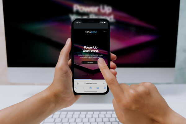
How NATABENÉ Approaches Colour
When we develop a brand identity, colour is never an afterthought. It’s part of the foundation.
We explore palettes that:
-
Reflect the brand’s personality and tone of voice
-
Translate well across digital platforms
-
Stand the test of time, but still feel fresh and relevant
-
Balance emotion with strategy
Whether we’re designing a bold new brand or refreshing an existing one, we choose colours with intention, not just style.
Final Thoughts
In branding, colour is never just colour. It’s one of the most immediate, memorable, and emotional elements of your identity. Get it right, and you create something people feel before they even think.
Want to build a brand that truly reflects who you are? Let’s talk about colour.